 Naked Fish Logo
 - A good friend who opened up a sushi restaurant in Hayward, California asked me to create a logo and design a menu for her. I was paid in sushi and a cool t-shirt with the logo on it.
 MyCheats Logo
 - We were launching MyCheats.com, a wiki-based site for users to upload and search for how to beat a video game. The logo creation process was slow going in the first several days because there were too many other priorities. Somewhere in the midst of three crazy months of redesigning 1up.com and launching Gamevideos.com and MyCheats.com, I designed this little devil late night in my air-deprived office in Ziff Davis. It quickly became one of my favorite. One of the runner up logo idea was a series of control pad buttons used to a special fighting combo in Street Fighter, one of the original game cheats.
 Sync Magazine Logo
 - I was contracted to design a prototype of a slick techo-gadget mag and it started with a logo. It was easy enough to envision how the logo would work with the magazine. I went searching for rave fonts to add a certain character and found Steelwolf Medium. I added a twist of opposite pointing arrows to play with the name. The creative director thought it was a little too good of a logo that it was distracting from the content. It was so good, it was distracting!
 Tutor Corps Logo Exploration
 - Tutor Corps, an elite tutoring company, approached me for a rebrand and a new website to match. Most visual representation of education - apple, books, school buildings - are overused and cliché. They initially wanted to go with a school crest design with the laurel leaves wreath but during the first pass we saw that it didn't represent the company image. I simplified the laurel leaves. The top logo came from the torch of achievement (Olympics) with laurel leaves as the flames. For now we're going with simple text logo while they mull these ones over.
 What They Play Logo
 - It was the third time I launched a magazine or website with John Davison and this time it was his own startup. Simon Cox, my creative director and collaborator, thought of the idea of using the talk bubble for the logo. And somewhere during some after-work pow-wows we decided Georgia was the font of choice. Really? A web font? If you're stylish, you can wear anything well.
 Love Your Body, Love Your Life! Logo
 - When I received this logo project, the cliché image of a heart was easiest exploration to take. The trick is to put a creative twist to something so overused. I was stretching my arm from being on the computer so long and I stopped - the logo idea came from my gesture.
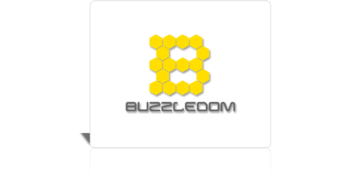 Buzzledom Logo
 - With a name like Buzzledom, how can you not come up with this logo?
 Imerex Logo
 - Imerex is focused on helping their clients rank high on Google searches. The challenge is to find a visual element to represent online marketing. It was tough pin down imagery with an abstract concept. I eventually went with idea of being "found" online. The design exploration included using an arrow cursor, a target (I used the last letter, X, as a target), mouse clicking motions, and hand icon with pointing finger (when the cursor hovers an active link). I thought this logo was clever but I wasn't sure about the client's preference. Some might only see "erex". I threw it in last minute and I'm glad they picked it. The font needed to have even widths, so no accents or serifs.
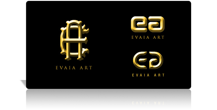 Evaia Art Logo
 - A friend wanted to display their art work online. They needed a logo and website in a short amount of time. I sketched up the final logo in the bus on my way to work. I came home, found an ornate font, and pieced it together. I spent a couple of more hours and came up with a dozen others alternative, two are shown on the right. But knowing her, I knew which she would pick.
 Edmodo Business Card Exploration
 - Everybody has an opinion about design and it's good to show clients different options. Of the various designs presented, I thought this is the business card that should have been selected. I reused the logo shape to put in the contact information.
 Xeno Application Logo
 - Xeno is an analytics product of Infocentricity. The name was derived from Zeno, a Greek mathematician known for his paradoxes. He concluded that if you're one step away from your destination and you take a step halfway towards it, and another half-step, and so on... you'll never reach it. Do you see that within the logo?
 Technology Company Logo Exploration
 - Three friends are starting their own web programming company. They didn't know what to call themselves so I threw out some ideas just for kicks. They ARE programming monkeys.
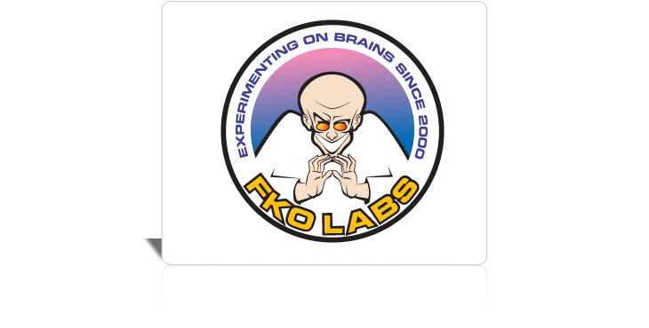 FKO Labs
 - Yes, it has been a decade since this establishment began their cranial experimentation. In some smoky underbelly of society somewhere, I do hope the Lab still survives.